HTML5 video as a page background
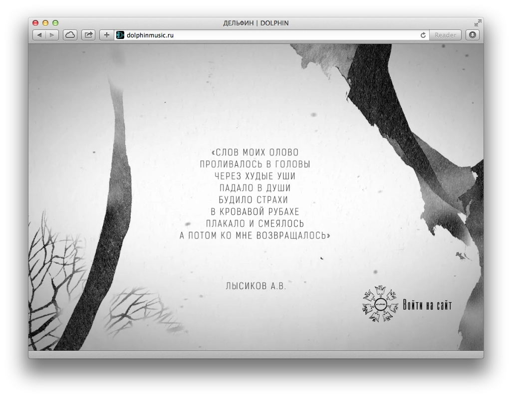
I recently made a promo page for Dolphin’s site for a book of poems that is coming out soon. During the discussion I suggested making it in the form of video, so the animations would look nice. Along the way a few nuances surfaced.
1. Video formats
March 2024: all current browsers already support both WebM and H.264.
Back in the day, browsers split into 2 camps: those that supported H.264 and those that preferred open formats such as OGG/Theora and WebM. So you needed at least 2 versions of the video.
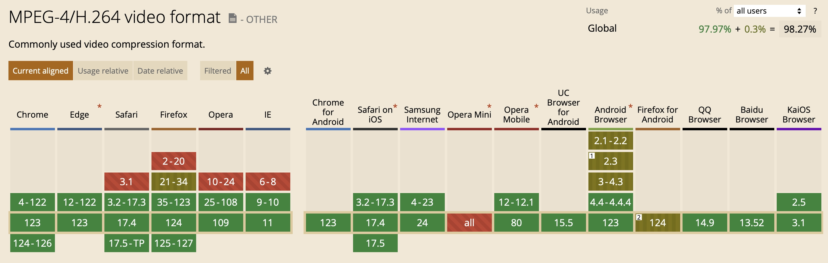
H.264 is supported as of April 2024:
WebM is supported as of April 2024:
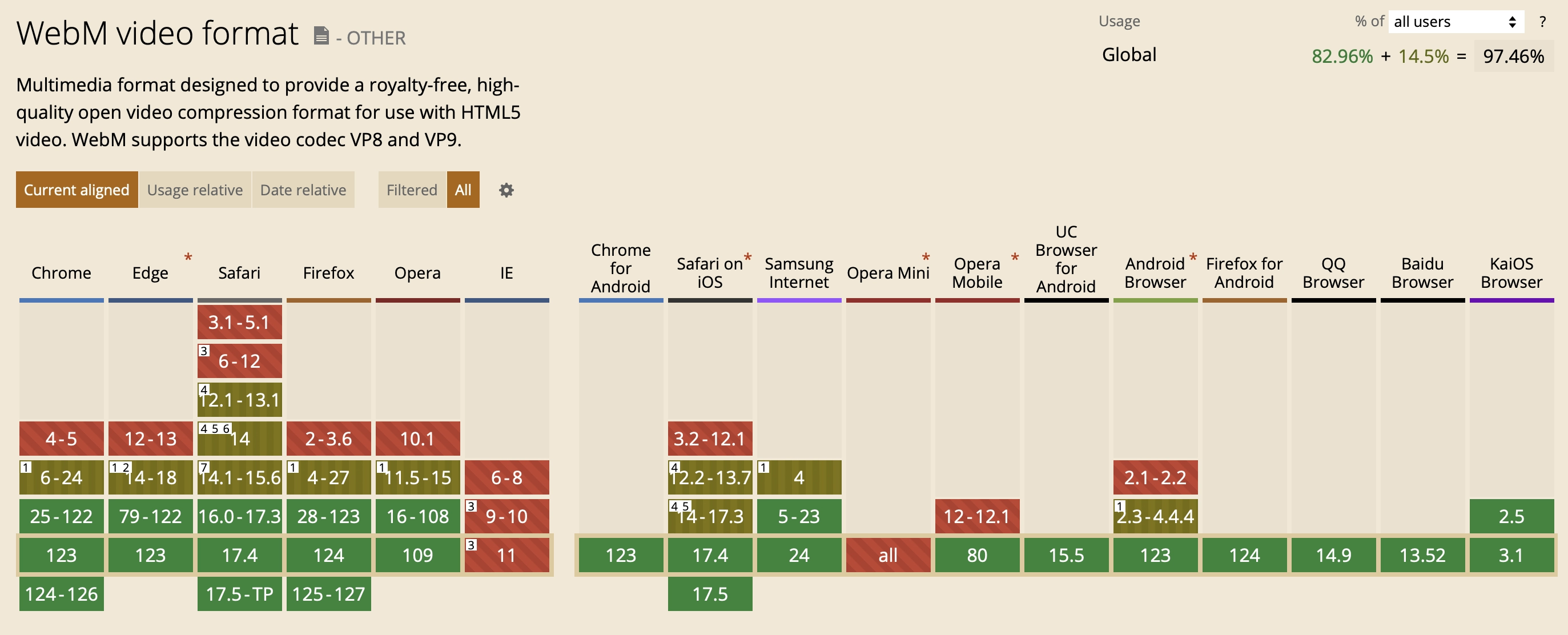
As we can see, all desktop browsers (except the dead IE) and current mobile browsers support both formats. Pick whichever you want. But if you want to support older versions (and Firefox for Android), which support only one format, you can include both H.264 and WebM.
2. HTML and CSS
Video code:
<div id="trailer" class="is_overlay">
    <video id="video" width="100%" height="auto" autoplay loop muted playsinline preload>
        <source src="book.mp4"></source>
        <source src="book.webm" type="video/webm"></source>
    </video>
</div>
And CSS:
.is_overlay{
    display: block;
    width: 100%;
    height: 100%;
}

#trailer {
    position: fixed;
    top: 0; right: 0; bottom: 0; left: 0;
    overflow: hidden;
}

#trailer > video {
    position: absolute;
    top: 0; left: 0;
    width: 100%; height: 100%;
}
That code really says it all: stretch the #trailer div to the full screen, place our video inside it, and because it has the autoplay attribute it starts as soon as the browser decides it can start playing, since preload="auto" is set.
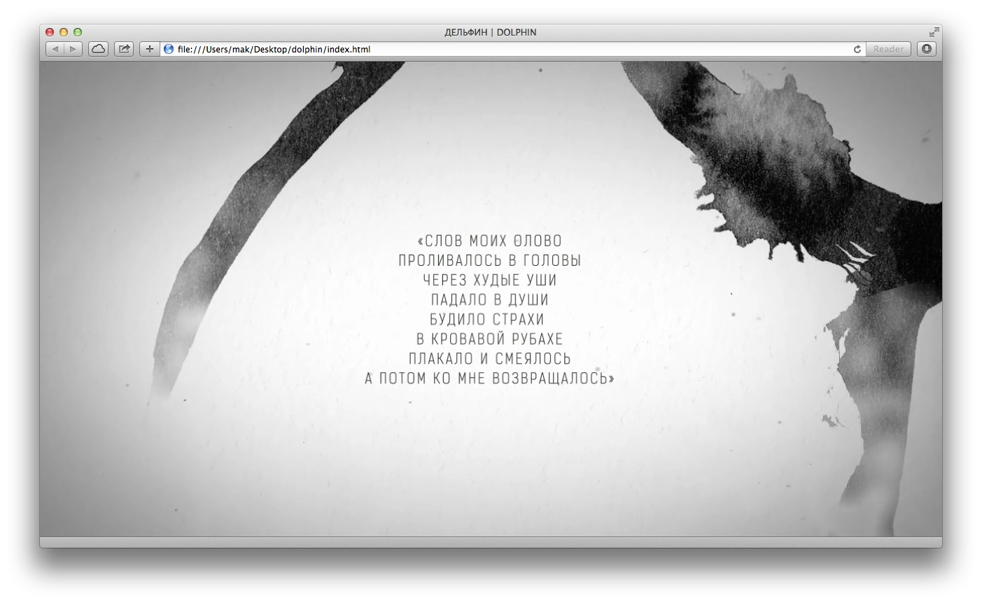
We get a picture like this:
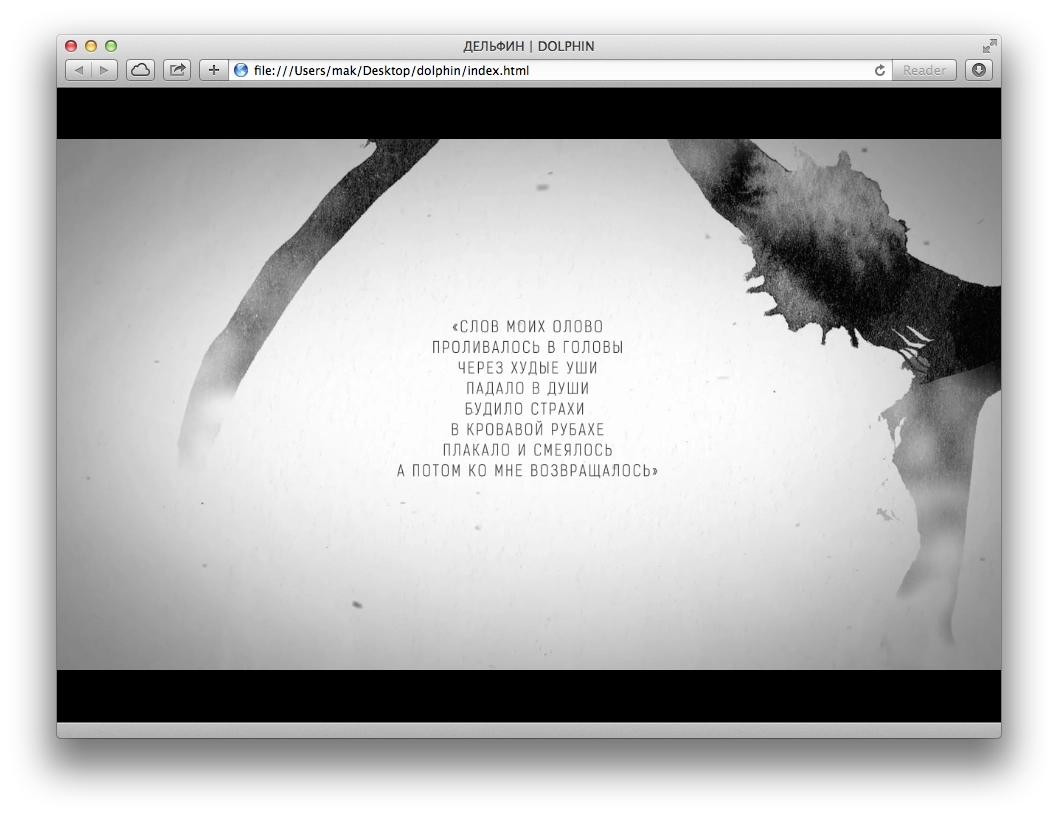
We can see black bars on the sides. You can also change the CSS for #trailer > video so they disappear:
min-width: 100%;
min-height: 100%;
width: auto; height: auto;
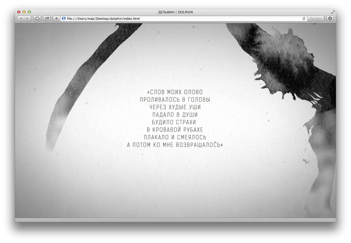
Then we get a video stretched to the full width:
Everything looks good... until we resize the window. Suddenly:

This is where CSS Media Queries come in handy for controlling proportions. Remove the CSS added in the previous step and add this instead:
@media (min-aspect-ratio: 16/9) {
    #trailer > video { height: 300%; top: -100%; }
}

@media (max-aspect-ratio: 16/9) {
    #trailer > video { width: 300%; left: -100%; }
}

/* Если есть поддержка object-fit (Chrome/Chrome для Android, Safari в iOS 8 и Opera), используем его: */
@supports (object-fit: cover) {
    #trailer > video {
        top: 0; left: 0;
        width: 100%; height: 100%;
        object-fit: cover;
    }
}
This lets us center the video for different window / screen sizes.

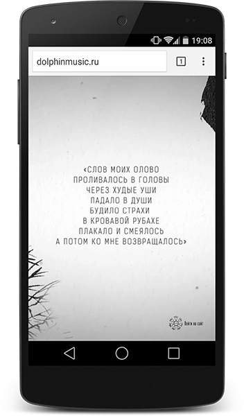
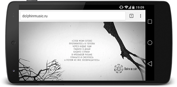
There we go. Looks nice. Now everyone will see the main part, the text.
3. Mobile browsers
Mobile browsers are where things get tricky.
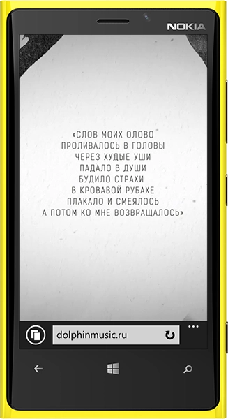
Internet Explorer on Windows Phone shows everything and plays it without issues; playback starts automatically.
In Safari on iOS, as of March 2024, autoplay works if you specify the playsinline attribute on the video tag, but only if Low Power Mode is not enabled. If it is enabled, the video will not play.
To determine whether power-saving mode is enabled, you can use this JS code and, for example, show an image instead of the video:
// находим видео
const videoElement = document.getElementById("video");

// картинка, которой заменим видео
const poster = document.getElementById("poster");

if (videoElement === null || poster === null) {
    return;
}

const promise = videoElement.play();

if (promise !== undefined) {
    promise
        .catch(error => {
            // Автовоспроизведение не удалось
            if (error.name === "NotAllowedError") {
                // скрываем видео
                videoElement.style.display = 'none';

                // показываем картинку вместо видео
                poster.style.display = "block";
            }
        })
        .then(() => {
            // всё хорошо
            videoElement.play();
        });
}

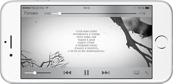
As of March 2024, autoplay works perfectly in the latest Android versions. But I am leaving the paragraph below just in case.
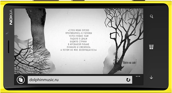
Android was the hardest. Autoplay does not work. The Play button appears only if you add the controls attribute to the video tag so that the standard playback controls show up. Unfortunately, that is no longer as nice. But that is not all. To make the video start playing, you also need to add a Javascript handler that explicitly tells the video to play:
var video = document.getElementById(element);
video.addEventListener('click',function(){
    video.play();
},false);
To detect Android and add the controls attribute, I simply used Detect.js:
var ua = detect.parse(navigator.userAgent);
if ( ua.os.family === 'Android' ) {
    video.setAttribute( 'controls','controls' );
}
Also, for this to work on Android, you must not use the type attribute inside source.
That is how it is. The final result with the preloader is here.