Recap of Apple Developers Community #7 meetup
Went to Apple Developers Community #7 today. The talks were about marketing iOS apps. Two people effectively presented — a representative from Nevosoft, who seem to crank out games on a conveyor belt, and one indie developer.
It was pretty boring. What they said could have been said much faster. The woman from Nevosoft was asked silly questions for ages. As always, there were a couple of know-it-alls in the room itching to demonstrate how clever they were.
Not that there were any revelations, but a lot of things, until someone says them out loud, don’t feel important and don’t stay in your focus.
Key takeaways. The app icon is very important. Insanely important (I’m not being sarcastic) — the first thing the user sees is the icon in the listing. It should be bright; the advice was to take a screenshot of the App Store, drop your icon into it, and check whether it stands out and catches the eye. Plus look at how it looks on the iPhone home screen among other apps — the user should be able to spot it visually quickly.
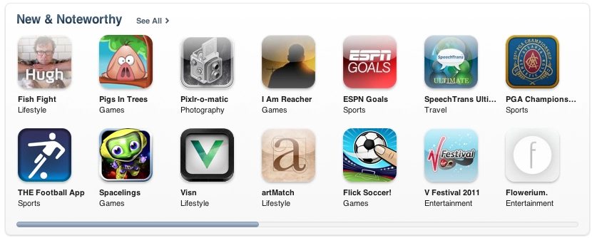
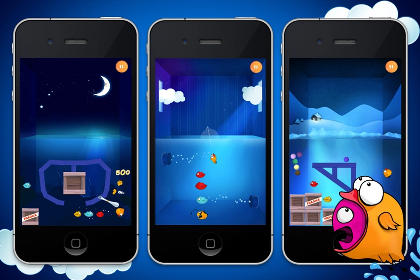
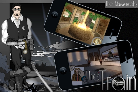
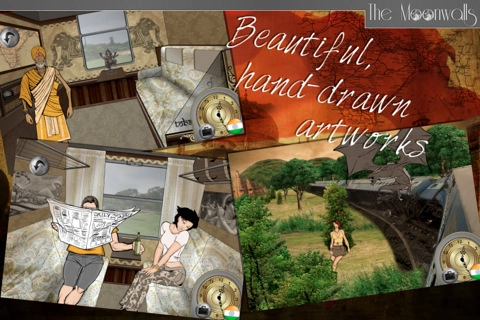
The second thing the user sees is the app screenshots. How they look matters too — they need attention. If they don’t hook the user, they won’t install your app even if it’s free (from my own experience — agreed). The view was that doing plain app screenshots isn’t always worth it — they look much more appealing if presented somehow, e.g. composited inside an iPhone mock-up. Apple doesn’t require screenshots to be strictly app screenshots, and many people exploit this, building entire collages.
On launch day you get a head start by appearing in the «New» list within your category. So later sales/downloads largely depend on the first day.
Then they talked about the description and choosing keywords. People usually try to pick keywords cleverly so that fewer competitors show up for them and you get noticed. It’s a double-edged sword — you can find a word for which you’re alone, but no one would think to type it. The indie developer claimed that if a keyword appears both in your app name and in the keyword list, you rank higher. That’s his personal experience.
Worth investing in the description too — if people read it at all, they read at most the first lines. Walls of text discourage further reading (again, agreed from experience).
Apple requires apps to have a website / web page. It’s a mandatory condition so users have a way to give feedback to the developer. And again — to a degree it generates user flow.
Then they discussed various ad networks, click-throughs, and the pros and cons of Full and Lite versions — also a double-edged sword. On one hand, Lite drives traffic to the Full version. On the other, promoting two apps is harder than one.
The indie developer said you have to polish everything — do every possible localisation (he commissioned translations into European and Asian languages), and each new localisation brought him a percentage of new users. Work properly on press releases, especially in other languages, even outsourcing them to specialists for proofreading.
And, most importantly — the app shouldn’t be crap, but that one’s obvious.