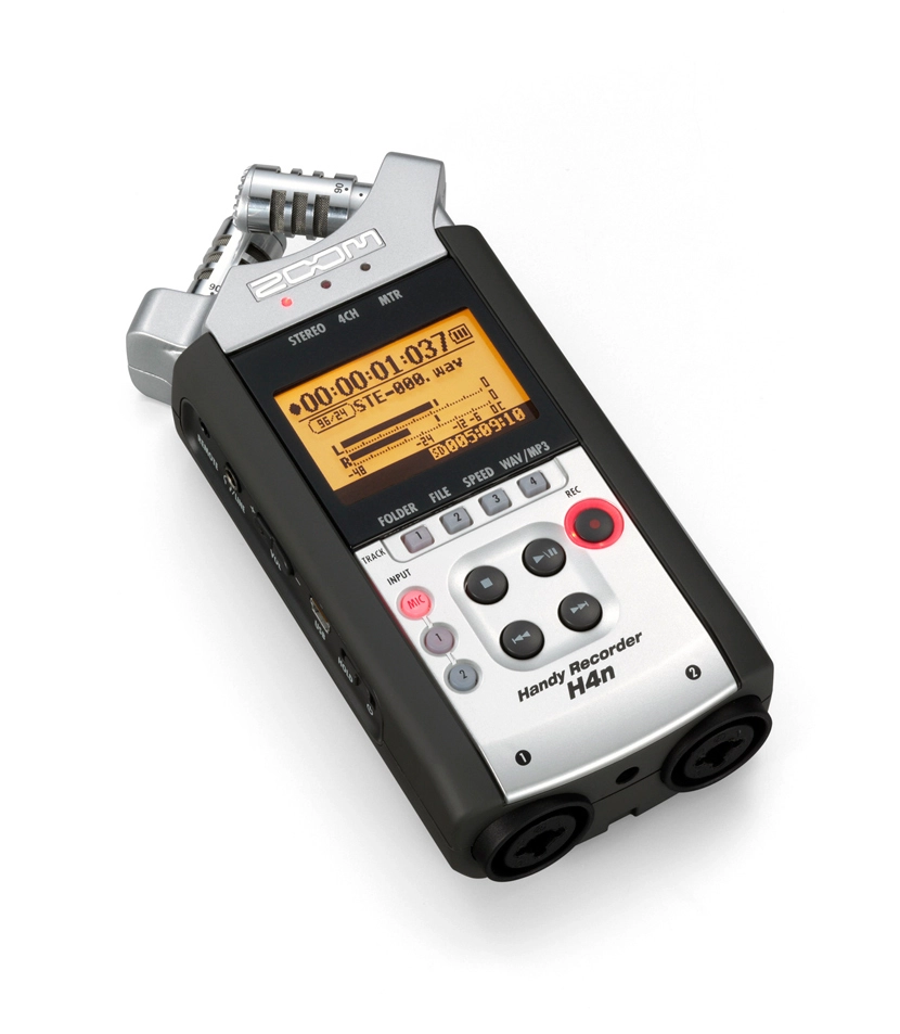
My Rode Stereo VideoMic couldn’t handle loud gigs and was clipping the sound. On Tuesday I became the proud owner of a great little device, the Zoom H4N.
I won’t bother describing what’s great about it — that’s all over the internet. I’ll just say the recording quality is excellent. And, most importantly, it copes brilliantly with concerts. To put it through its paces I went straight to a show at Orlandina, where the German band WE BUTTER THE BREAD WITH BUTTER were playing yesterday. They play heavy stuff, so the recorder was thrown straight into the deep end of a loud, heavy gig.
In the recorder’s settings there’s a COMP/LIMITER option — as I understand it, that’s a set of presets for recording. I shot a video at the show with audio from the recorder. It’s in two parts. The first I recorded with the LIMIT2 (CONCERT) preset and a manual recording level (level 8 out of 100). I’m not too happy with how that came out. The second part used the LIMIT3 (STUDIO) preset — even at home it makes the sound cleaner and more pleasant. I left the recording level on AUTO. I like the result much better.
Either way, the way the audio came out at a gig like that is a strong sign that the device records very respectably. I think I’ll stick with it.
From the start of the video up to 9:43 it’s LIMIT2 (CONCERT) and recording level 8; from 9:43 to the end it’s LIMIT3 (STUDIO) with auto recording level. Result:
In this approach the app always has a Tab Bar — it’s always visible and you can always switch between tabs. Inside one of the tabs (or in all of them, if you like) there’s a view with a UINavigationController, in which you can move between views via push and pop.
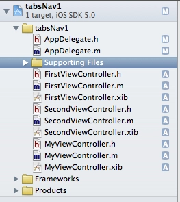
Create two new files of type UIViewController subclass (with the «with XIB for user interface» checkbox). Let’s name them FirstViewController and SecondViewController. These will be the two views displayed in the two tabs.
Our AppDelegate.h in the empty project looks like this:
Now over to AppDelegate.m. Here we need to import the FirstViewController and SecondViewController we just created, and add a @synthesize for the tabs:
Inside didFinishLaunchingWithOptions we put the following:
- (BOOL)application:(UIApplication *)application didFinishLaunchingWithOptions:(NSDictionary *)launchOptions
{
    // create the application window matching the screen size
    self.window = [[UIWindow alloc] initWithFrame:[[UIScreen mainScreen] bounds]];

    // create two UIViewController instances
    UIViewController *viewController1, *viewController2;

    // initialise the first view with our first controller’s interface
    viewController1 = [[UINavigationController alloc] initWithRootViewController:[[FirstViewController alloc] initWithNibName:@"FirstViewController" bundle:nil]];

    // initialise the second view with our second controller’s interface
    viewController2 = [[SecondViewController alloc] initWithNibName:@"SecondViewController" bundle:nil];

    // hook our views into the tab bar
    self.tabBarController = [[UITabBarController alloc] init];
    self.tabBarController.viewControllers = [NSArray arrayWithObjects:viewController1, viewController2, nil];

    // make tabBarController the app’s root view controller
    self.window.rootViewController = self.tabBarController;

    [self.window makeKeyAndVisible];
    return YES;
}
Now on launch we’ll get a tab bar at the bottom of the screen. Each tab will have its controller. The first controller (viewController1) will contain a UINavigationController, which lets us push and pop views. As an example let’s add another UIViewController subclass (with the «with XIB for user interface» checkbox). Let’s call it MyViewController. So the project now has 3 UIViewControllers:
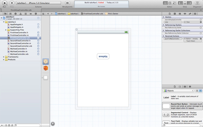
Since viewController1 (a.k.a. FirstViewController) contains a UINavigationController, let’s add some action to it that takes us to our controller. First, at the top of FirstViewController.m add #import "DetailViewController.h", then add a method:
Add a UITabBarController to the xib, wire it up in Connections Inspector. Create two views in the project — FirstViewController and SecondViewController — and in the UITabBarController inside RootViewController.xib, wire the tabs to those views.
Here’s the start of AppDelegate.m:
#import "AppDelegate.h"
#import "RootViewController.h"

@implementation AppDelegate

@synthesize window = _window;
@synthesize viewController = _viewController;

- (BOOL)application:(UIApplication *)application didFinishLaunchingWithOptions:(NSDictionary *)launchOptions
{
    // create the window
    self.window = [[UIWindow alloc] initWithFrame:[[UIScreen mainScreen] bounds]];

    // create the main controller
    self.viewController = [[RootViewController alloc] initWithNibName:@"RootViewController" bundle:nil];

    // create the UINavigationController
    navigationController = [[UINavigationController alloc] initWithRootViewController:self.viewController];

    // make UINavigationController the main controller
    self.window.rootViewController = navigationController;
    [self.window makeKeyAndVisible];
    return YES;
}
The general idea: self.window.rootViewController is a UINavigationController. The app has a RootViewController with its own xib. You can leave it empty, but it needs an @property:
When the RootViewController’s view loads, we immediately push our tabBarController. So the first thing the user sees on launch is the tabs and the top bar with a Back button — which you can hide here and show only later somewhere else.
The main upside — inside the views loaded inside the UITabBarController you can navigate the main screen to other views and back, all from code. Video:
The VKontakte iPhone app is built on this principle. My example isn’t implemented perfectly — could be polished — but it works. Download the example.
Will come in handy in the future — and going through it again helped me lock it in.
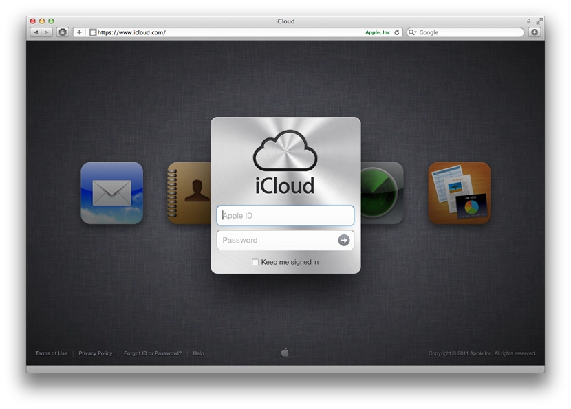
Well, the new macOS with iCloud support is out, and iCloud itself has come out of beta.
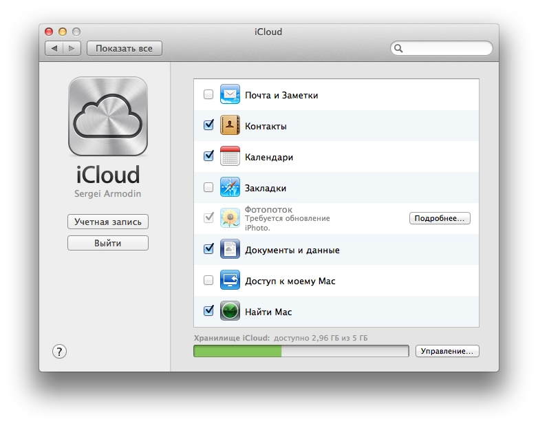
So, after installing the updates, immediately after the system reboots you’re prompted to sign in to iCloud with your Apple ID. After signing in, you’re asked to tick the services you want to use.
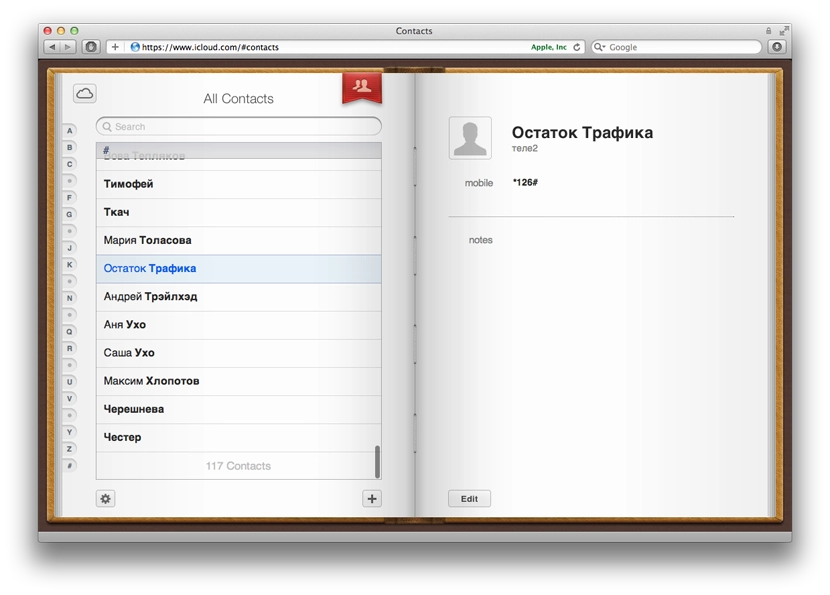
I decided not to tick Mail — I don’t really see the point. I already use a mail client on both my computers and my mobile devices. Mail is over IMAP, so it all syncs anyway. Contacts is a relatively useful thing. I personally don’t need it yet, but after turning it on, all the contacts from the address book on the phone showed up on both my Macs.
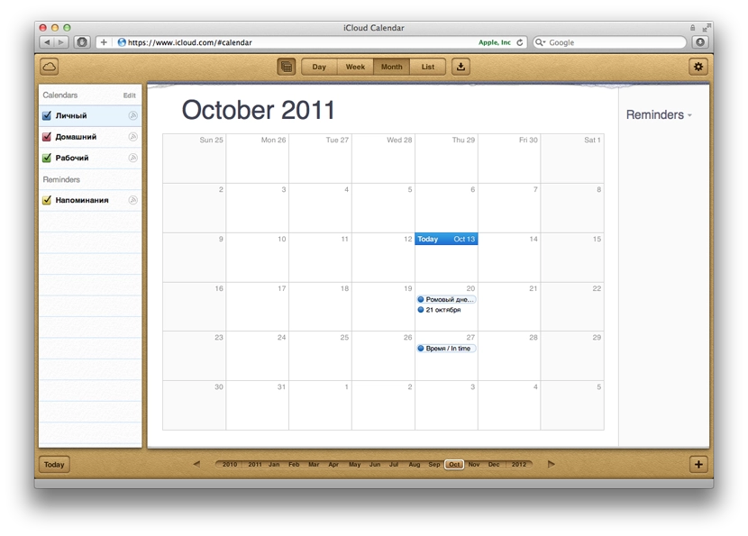
The most useful thing, in my view, is calendar sync. I really didn’t want to bother syncing through Google and keeping a calendar there, especially since the only Google service I use regularly is YouTube. It’s very nice that everything now works and syncs out of the box. For example, I added the dates of film premieres I want to watch. They appeared in the calendars on all my devices and Macs. There is one annoying detail though — I added these events on one of the Macs. After syncing, those events were duplicated on it. But that’s probably an early-days glitch and an Apple oversight. After adding a new event it appeared everywhere just once.
Documents are still unclear. The desktop iWork apps only offer to publish files to iWork.com, which is still in public beta.
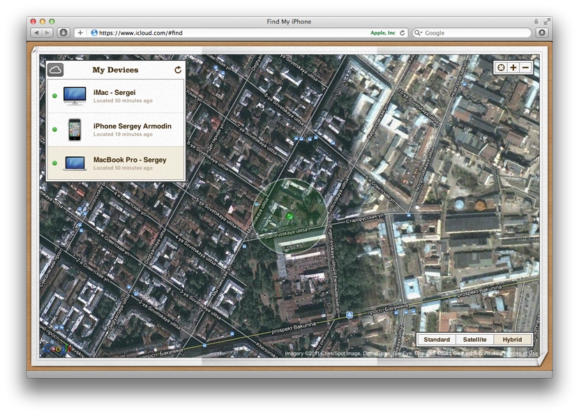
The «Find My Mac» feature lets you later track on iCloud.com where it is. As I understand it, this is for the case when it gets stolen, or you left it somewhere and don’t remember where.
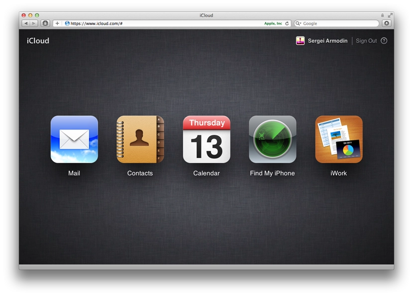
iCloud.com is now also open to everyone — styled in the spirit of iOS, offering 5 tools (or rather 4).
Mail should be a web interface similar to the standard Mail app. Contacts and Calendar look exactly like the standard Mac OS apps.
The Find My iPhone feature looks pretty entertaining — despite the name, it shows not only phones, but also Macs that have «Find My Mac» enabled.
You can send a message and a sound alert to the devices. It arrives instantly, and on top of that you get an email saying that such-and-such message was sent and delivered to the device. You can remotely lock the device or wipe it. For iPhone there’s even a toggle — when found, immediately email me. So the location is monitored somehow, without your involvement, it seems.
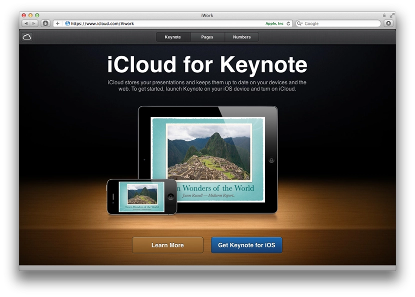
The iWork section currently contains only ads inviting you to install the iWork apps on your iOS devices. Apparently those already work with iCloud. None of the iWork apps are installed on my iOS devices — no need.
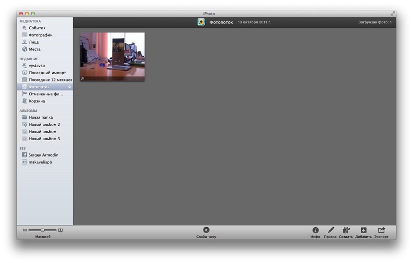
On an iOS device, in the iCloud settings you can turn on Photo Stream. From the moment you turn it on, all new photos start being uploaded to iCloud and become available on your other devices. Only new ones are uploaded — i.e. the ones taken after enabling the feature. Anything taken before — doesn’t go anywhere. Here’s how they look in iPhoto on the Mac:
You also need to enable Photo Stream in iPhoto. As soon as I took a photo on the iPhone (and opened the photos list), the photo started flowing into iCloud. It appeared in iPhoto automatically without any action from me.
The most puzzling feature for me so far is «Back to My Mac». Judging by the icon, it’s a way to connect to your Mac via remote desktop, but I haven’t found out how to actually do it. I really want to use this feature to connect to my home computer from work, since TeamViewer is getting on my nerves with its glitches and intrusive messages, opening its website and offering me a paid version. Update: a description of how it works.
I didn’t enable Bookmarks in iCloud, since I barely use Safari. The bookmarks of the Opera I use are already synced through their built-in Opera Link service.
The cloud also stores backups of my iPhone, which have already eaten up almost half of the available free space. A useful thing if your computer suddenly dies. But somehow that doesn’t feel like a tragedy to me. The other syncs are also a kind of backup.
What I was looking forward to most was iTunes Match, but it won’t come for a while, and, alas, will only work in the US for now — like all the cloud music services, be it Amazon or Google. Sad — almost makes you want to write your own.
Tried a bunch of different mic settings at a show. The best combination — the -10 dB switch on, with the foam windshield fitted (turns out it doesn’t just protect from wind, it also helps against overload). Sadly, I still couldn’t get perfect sound, even though the gig was pretty loud. But it’s a lot better than the first attempts. The drums still get clipped in places.
I also lowered the recording level on the camera itself in the settings. Around 50% gives better sound. Going lower just makes the final video quieter without removing the clipping. Here’s the result:
I’ll keep filming at other gigs and figure out how to better isolate the mic acoustically so everything records cleanly.
Decided to get an external microphone for my Canon 60D DSLR, to record video at concerts with decent sound. After a bit of googling and brainstorming with @theproof, the focus settled on RODE products.
The mic is for a DSLR, so it has to have a hot-shoe mount to clip onto the camera. We figured: if we’re buying a mic, get one from a company that specialises in them, which RODE seems to be. The various Nikon/Sony mics were dismissed straight away. RODE has a fairly broad range. Within budget, the candidates were the condenser RODE VideoMIC and the RODE Stereo VideoMic. From the names it’s clear the first one records mono (and is also indecently long). The second one records stereo, which I like a lot more.
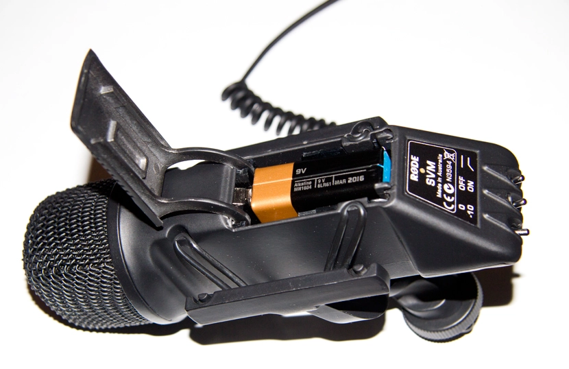
The mic needs its own power from a 9-volt battery, which is more of a plus than a minus — it won’t drain the camera battery. On a 9V it can run for about 60 hours, which is fine unless you’re shooting around the clock.
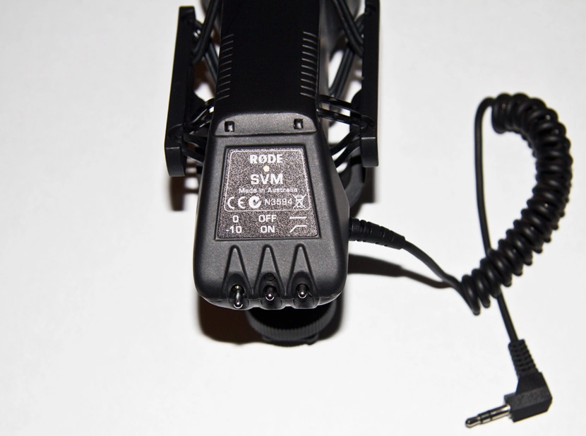
It connects to the camera via a 3.5 mm jack. It has three switches (it took me a moment to realise they’re switches — at first I thought they were buttons):
The left switch lets you cut the recording level by 10 dB, which is what you want when recording something loud — say, a concert (which is exactly what I’m planning to do). The middle switch is on/off. The right one, when on, reduces high-frequency noise — for example, traffic noise.
It also comes with a fluffy windshield for outdoor use in windy weather.
As usual, I didn’t read the manual or any tips. Just stuck it on the camera and went off to a show. Shot two videos. The audio came out clipped in places — I didn’t flick the -10 dB switch and I didn’t lower the recording level on the camera (recommended is 75%). For the record — it was a gig by two Japanese artists, Tezya and ASAKI. The internet calls it Future Glam Rock — for teenage girls, basically. It was in the small hall at Orlandina.
Resulting video:
Tomorrow I’ll try recording sound at the Smyslovye Gallyutsinatsii show with proper settings.
Today I did some big mass emails via Amazon SES. Delfin released a new music video, and I had to send a press release to about 1650 journalists’ inboxes and to 6500 inboxes from the fan base. A few numbers and a slap on the wrist from Amazon below the cut.
I started the campaign from an account specifically set up for the task, registered to, let’s say, the management. The account was new, so it had a starter limit of 1000 emails per day and 1 email per second, which obviously wasn’t enough. After hitting that limit I switched to my own account, which is already up to 10,000 emails per day and 5 emails per second.
The list had been built up over a long time of work. The result — out of 1650 inboxes, 240 emails bounced. Almost all of them — addresses that no longer exist. About 10 came back as spam, many of them on the same domain. Several bounced because the recipient inboxes are full and refuse new mail, which in my view is essentially the same as being dead.
Next came the list of 6500 — registered users of Delfin’s fan site (I don’t think they’ll mind, the news of a new video is a pleasant one, and a mailing like this happens at most twice a year). Some of those, of course, are spam bots that stalled at the email-activation stage. I have no idea how many bounced from that list — at 410 the inbox on Masterhost (where all the bounces and error messages were collected) glitched out. It stopped accepting new messages, and refused to even open some of them.
The result — 30 minutes ago I got an email from Amazon that says:
Dear Amazon SES Customer,
Our analysis of your Simple Email Service sending pattern is showing that certain parameter(s) of your sending are at unacceptable levels. If these metrics do not improve, we will suspend your SES sending privileges. For each metric that is at an unacceptable level, we will allow you a defined number of emails to be sent to bring the metric back up to acceptable levels. Please note that if your sending quality decreases further actions may be taken before you have sent the number of emails noted below.
*Unacceptably High Bounce Rate: 1,414 of the last 11,000 emails you have sent have bounced.
*This issue must be fixed within the next 40,000 emails you send.
So they basically wagged a finger at me — 1,414 emails bounced and the sending quality is suffering. Don’t fix it, and we’ll throttle you.
Looked at the stats — 7,429 emails went out from my account in 24 hours. Which means about 19% of the messages were sent in vain and threaten sanctions.
The takeaway — if you’re doing (legitimate) mailings, you have to keep your address list fresh. It saves nerves and time later.
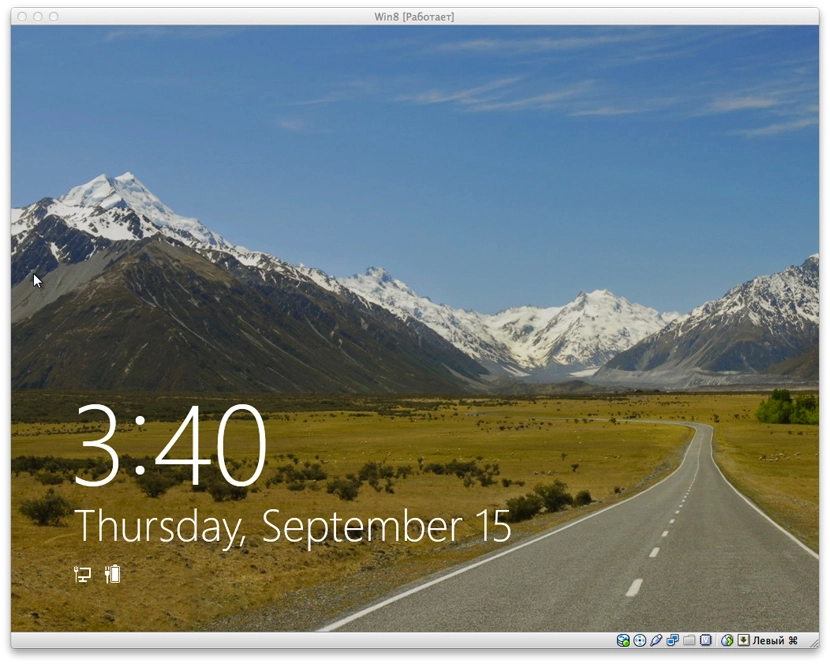
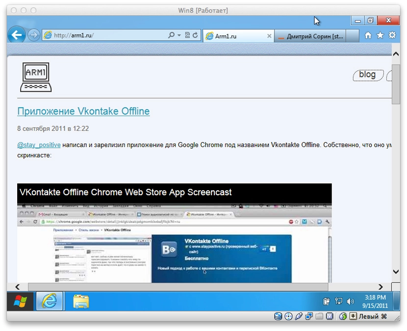
Installed the new Windows Developer Preview in VirtualBox. It started up on the third try, but it did. The new Metro interface gave the impression that it’s entirely aimed at tablets and finger control.
It’s wildly slow on the VM in places — though I only allocated it 1 GB of RAM.
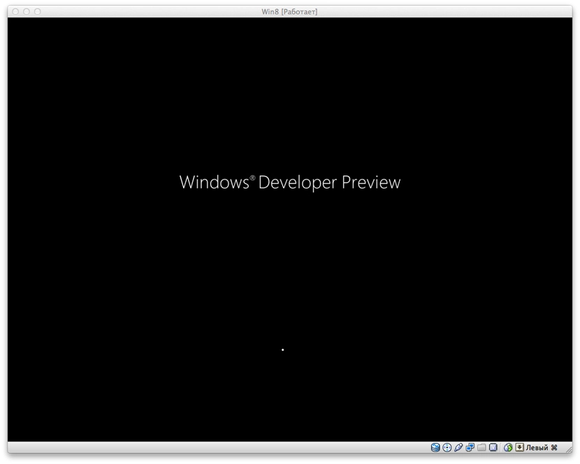
The boot screen is modest:
After loading you see this beauty:
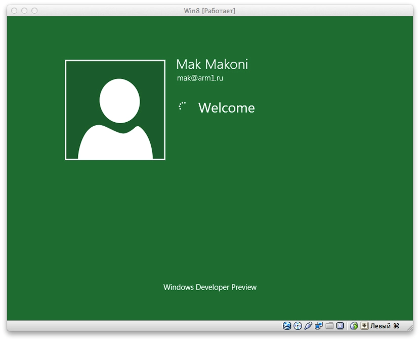
Drag this screen up with the mouse and log in on the green screen:
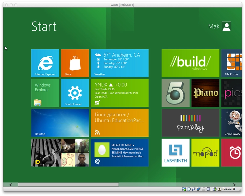
And here’s the Metro interface’s start screen. It’s made of widgets that surface information from their apps.
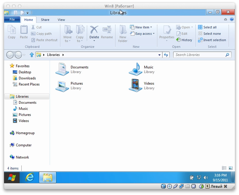
Tapping Desktop drops you into the familiar Windows 7 / earlier interface. The first thing you notice is a different Start button. Pressing it doesn’t open the usual menu — it takes you back to the Metro start screen.
The new Explorer with the ribbon interface is, to me, simply hideous. Microsoft argues that this interface is the result of some research, and that everything is more convenient and clearer for users this way. I have serious doubts. Although maybe I’m spoilt by the minimalism of Finder on Mac OS X.
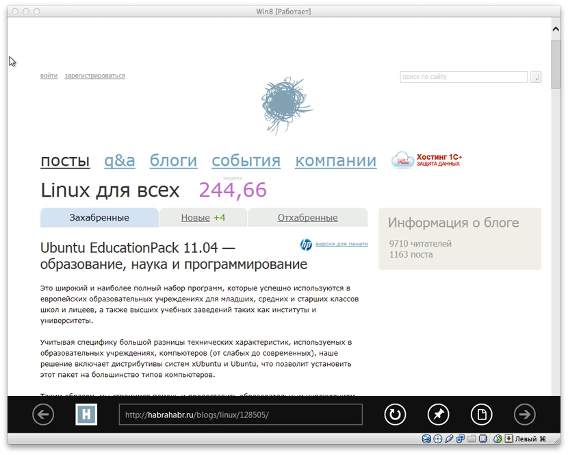
The system ships with Internet Explorer 10. In the familiar Desktop mode it looks familiar. I didn’t feel particularly motivated to dig into it.
If you go back to the Metro interface and open Internet Explorer there — it looks more like a tablet-oriented app. And visually it fits the interface.
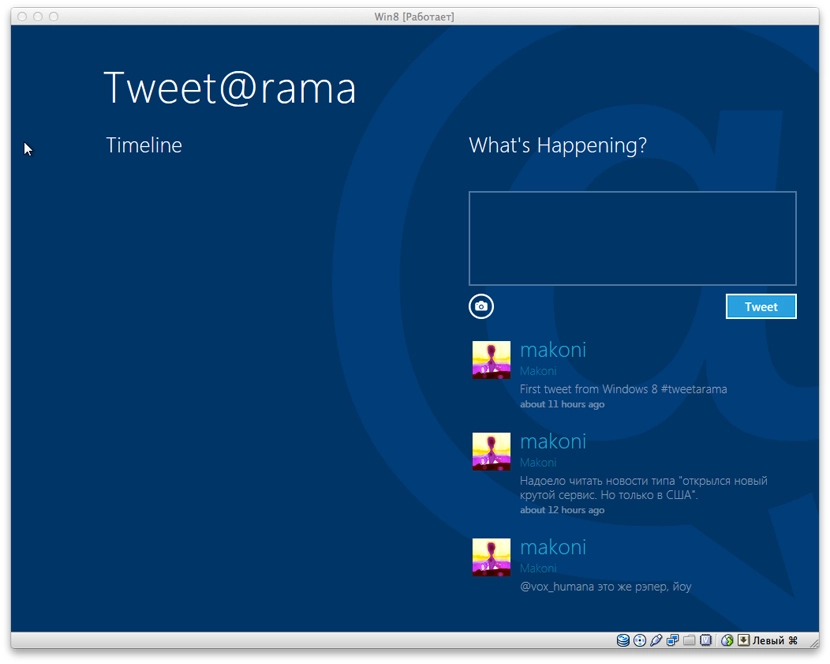
Back to the widgets. The first thing I launched was Tweet@rama. Logged in. For some reason the app didn’t load the timeline — only the list of my own tweets. Scrolling further right shows the list of followers and people I follow.
It’s only a list, though. Clicking a person’s username does nothing. Only clicking your own name in the list of your tweets opens up your account page on twitter.com inside the embedded Internet Explorer. Why like that — unclear. Clearly not finished.
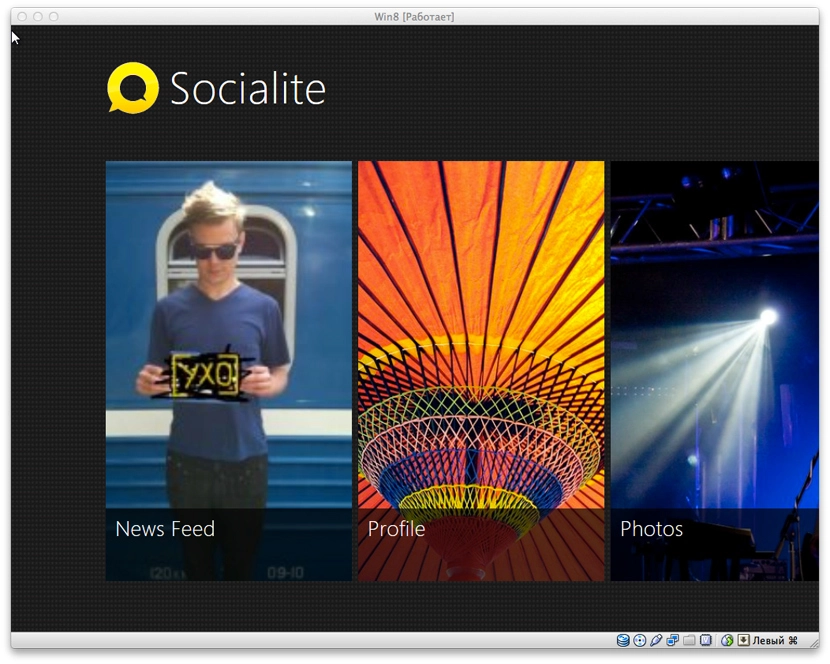
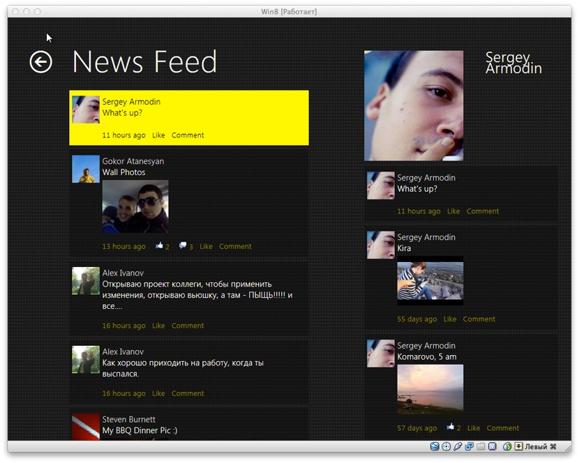
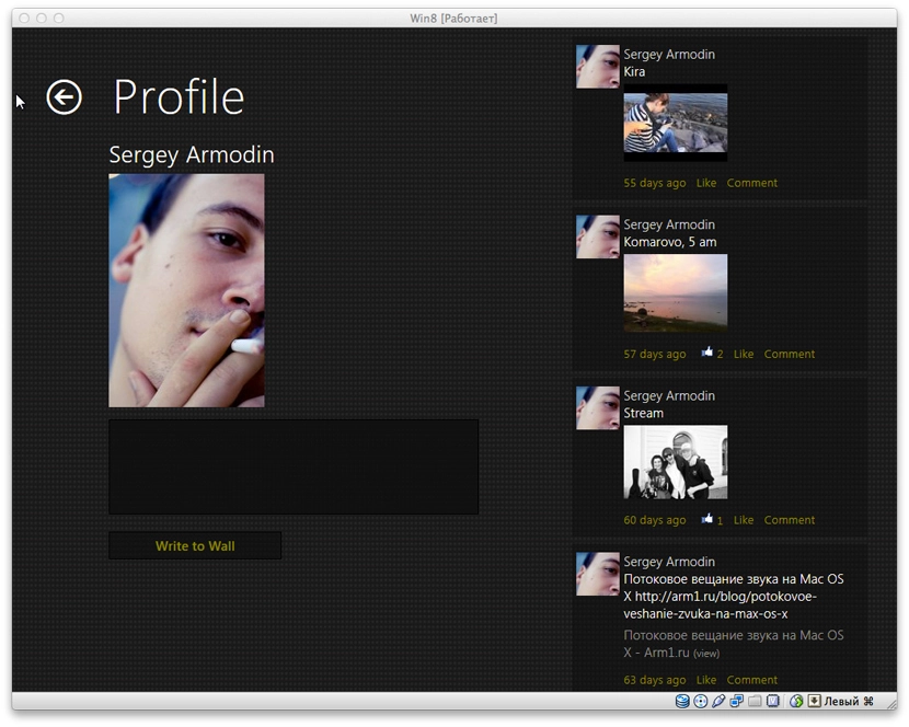
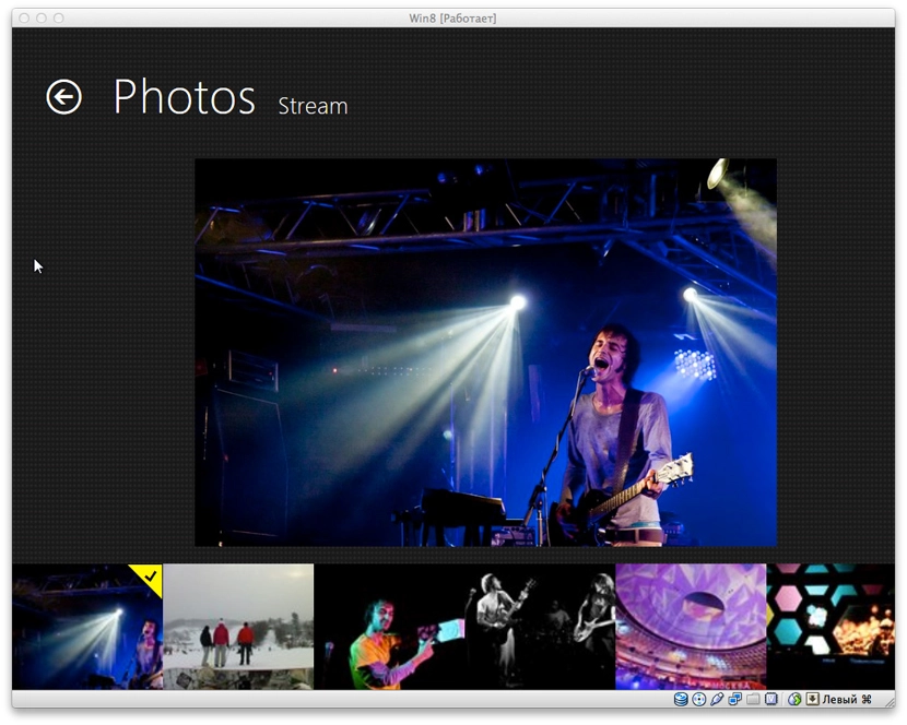
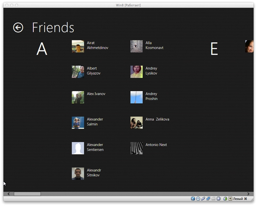
Next — Socialite. Social-network integration. So far it only integrates with Facebook. Maybe nothing else will be added. It looks pretty effective. The home screen lets you pick News Feed, Profile, Photos, Friends and Checkins. The names speak for themselves.
News Feed:
Profile. On the right — the user’s recent activity:
An album in the Photos section:
The Friends section is, I think, very well organised:
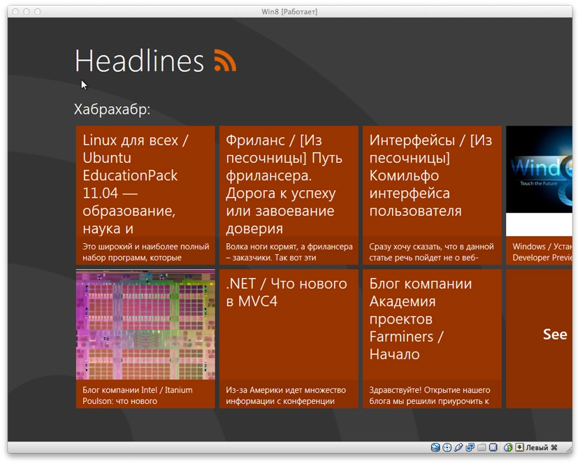
Next — the Headlines widget. The icon makes it clear it’s an RSS reader. Each subscription is on its own screen (again, like everywhere here, with horizontal scrolling). It shows the latest entries by default, but you can load more. Newly loaded entries extend the current screen further to the right.
That interface is eerily reminiscent of the Pulse News app for iPad.
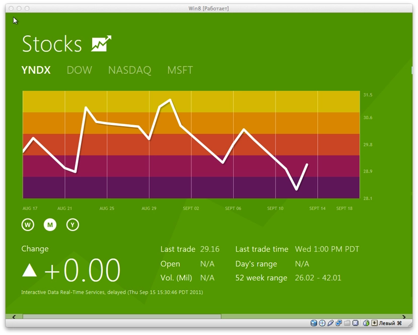
Another app — Stocks. Nothing extraordinary, all in the same pleasant style. Just charts and information.
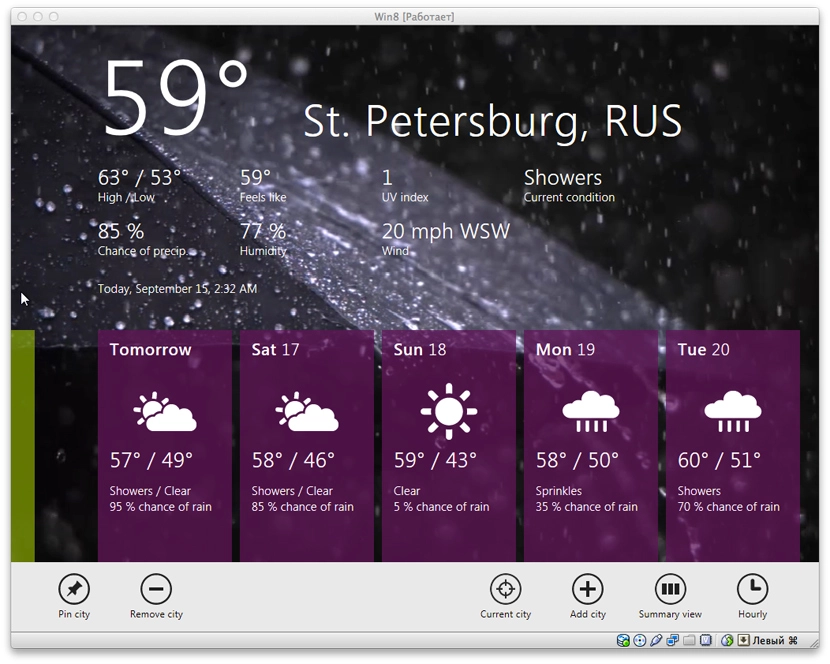
Weather is done very nicely — an animated background depending on the weather; if it’s raining in your city, you get a rain video as the background. iPad-app vibes again. Temperature defaults to Fahrenheit, by the looks of it. I couldn’t be bothered to find where to change it.
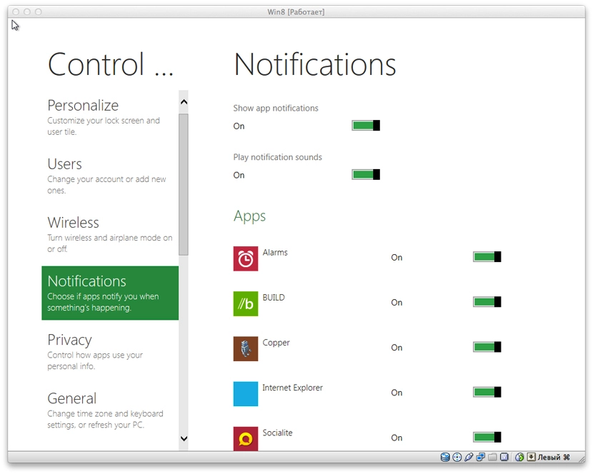
The Control Panel is also done in tablet-app style:
There’s a set of standard sample apps too — like a jigsaw puzzle game. Nothing particularly interesting though.
The Near Me app, judging by the name, is supposed to be tied to geolocation and find people or places nearby. It refused to launch on the VM, crashed and dumped me back on the start screen. The same happened with a couple of other apps.
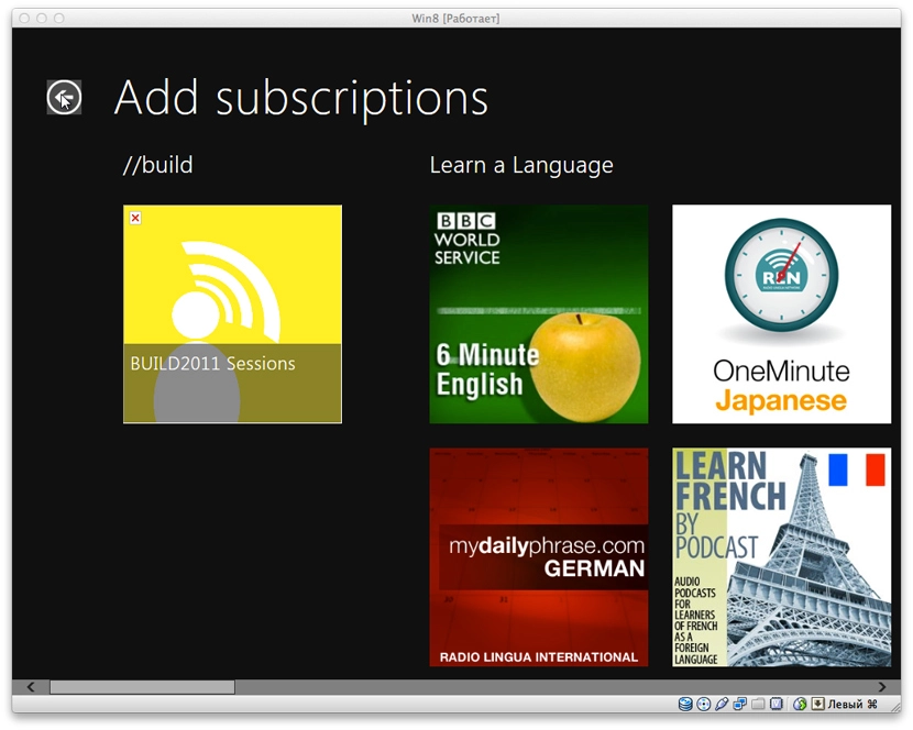
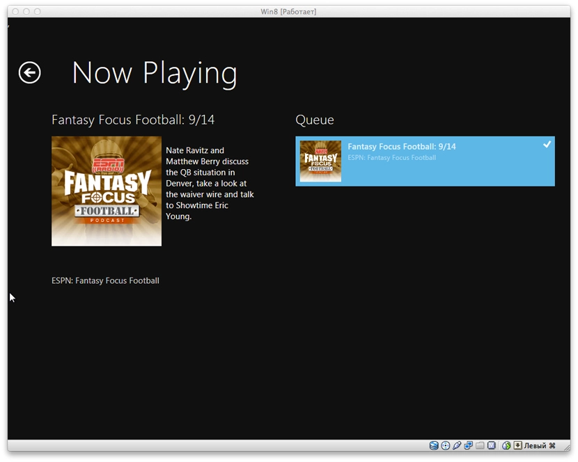
There’s a mopod app — you can subscribe to and listen to podcasts in it. There’s a built-in subscription list. You can also add your own podcast by URL.
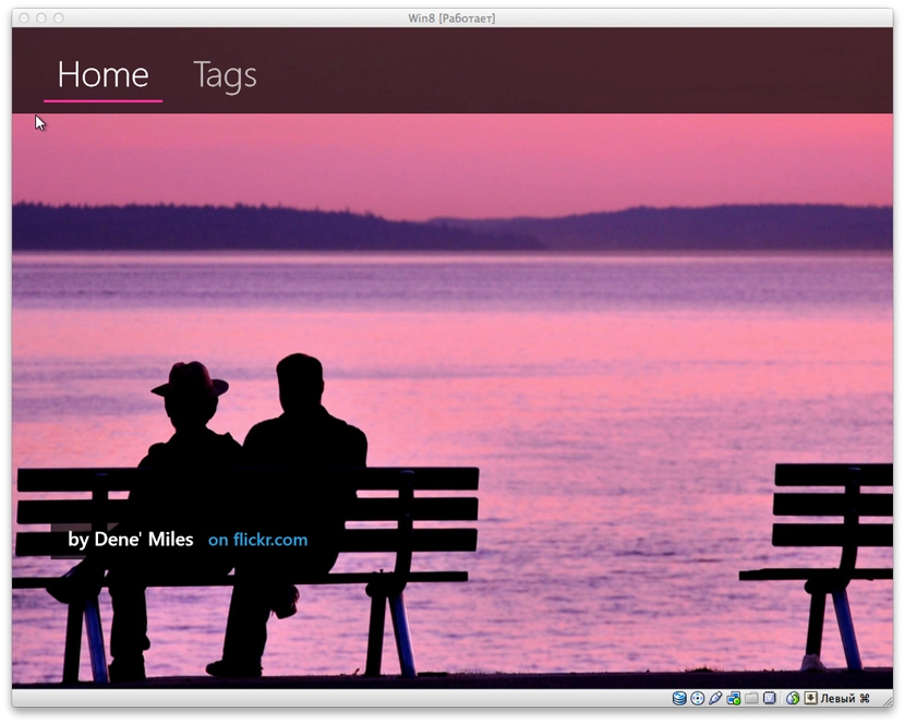
There’s also picstream — uses the Flickr API and, as the name suggests, displays photos from there as a slideshow. By default it shows what’s popular on Flickr. You can also pick tags, but that didn’t seem to work for me.
I expected to see apps for listening to music or watching video — strangely, I didn’t find any.
Overall the interface is cool. Switching between the classic and Metro UIs feels rather jarring. On tablets I think it’ll look great, especially since Microsoft has already road-tested a lot of this on Windows Phone 7. The main thing now is that there be software.